Project Type
Audit & Redesign
Deliverable
Home Page Prototype
Client
Case Study: Dubai Design District
Rethinking
the Regular
Dubai Design District (d3) is the region's premier creative hub — home to 160+ design companies, 45,000+ creatives, and a thriving community that pushes the boundaries of culture and commerce. Yet their digital presence wasn't keeping pace with their world-class physical identity.
This project took a structured, research-first approach to diagnosing the existing website's shortcomings and delivering a redesigned home page that is more functional, more navigable, and better aligned with d3's creative brand positioning.
The process spanned five distinct phases: a full site audit, competitor case studies, affinity mapping, information architecture restructuring, and a final high-fidelity UI design with a mini design system.
01 — Current Website Audit
Finding the
Friction Points
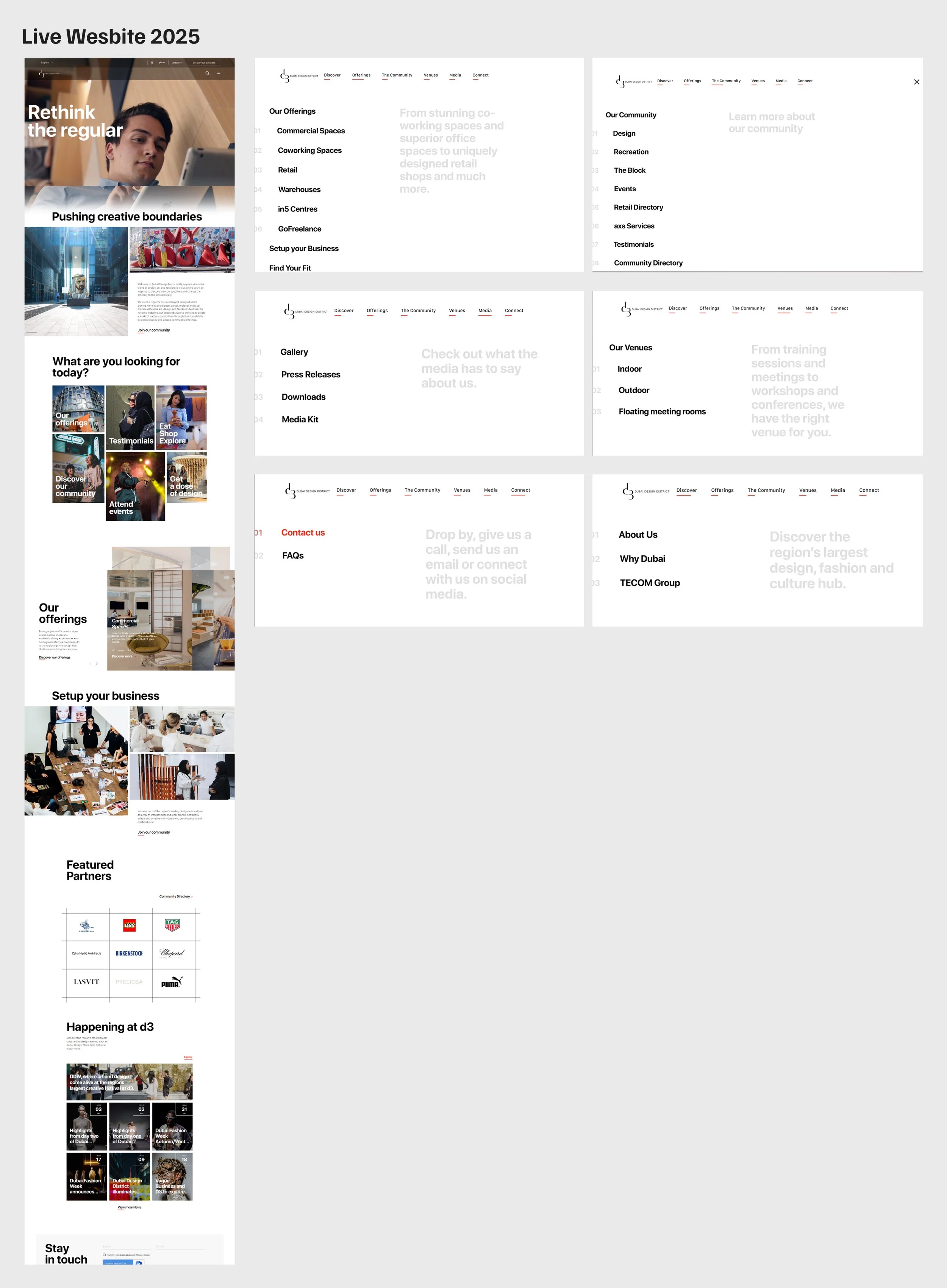
Before designing anything new, the existing website was evaluated against usability, information architecture, and visual communication standards.
What Wasn't Working
The audit revealed a disconnect between d3's ambitious brand identity and its digital experience. Despite being a world-class creative destination, the website's navigation buried key actions, and the homepage prioritized visual spectacle over user utility.
Four core problem areas were identified that would shape every subsequent design decision:
Invisible navigation
The menu was too subtle relative to the hero imagery, causing users to miss it entirely on first pass.
Disruptive full-screen menu
Opening the navigation hijacked the entire viewport — a pattern that interrupts browsing flow and feels dated.
Weak information architecture
Content groupings were inconsistent, making it hard to form a mental model of what d3 offers.
Homepage redundancy
Multiple sections repeated the same content themes, diluting focus and increasing scroll fatigue.
02 — Competitor Case Studies
Learning from
Global Peers
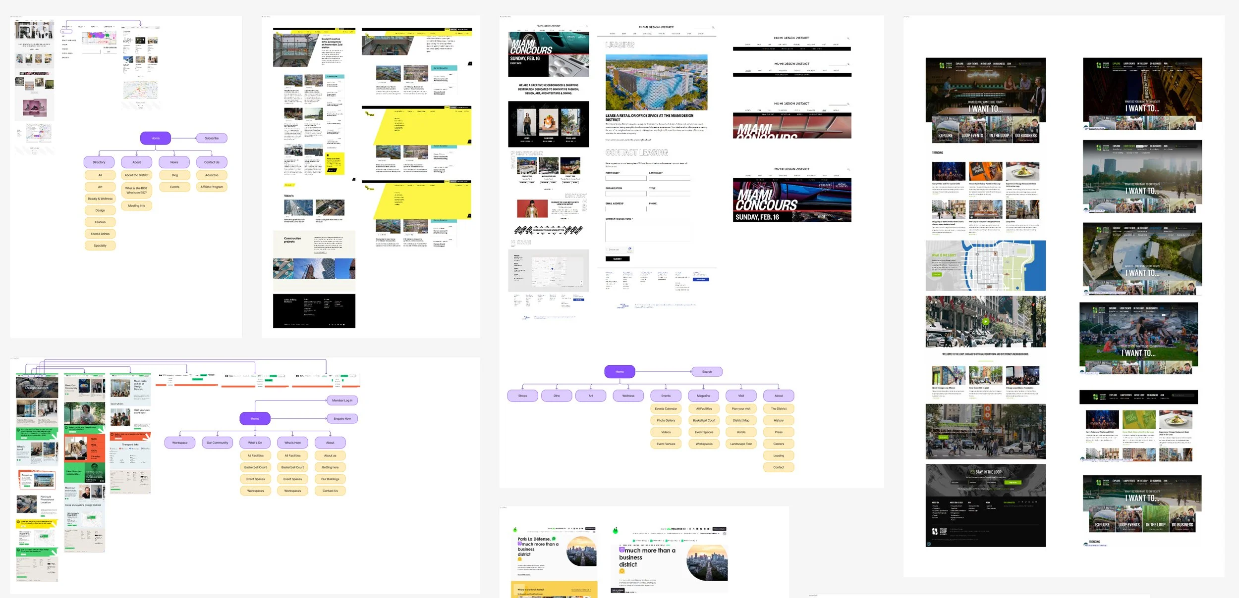
Six international design district websites were analysed to understand how comparable organisations structure their content and guide their audiences.
Six Cities, Six Perspectives
Competitors analysed included Naples Design District, West Hollywood, London Design District, Netherlands Zuidas, Miami Design District, Chicago Loop, and Paris La Défense. Each was mapped in FigJam — capturing navigation patterns, content hierarchies, calls-to-action, and visual language.
Key patterns extracted from this analysis directly informed the new information architecture for d3:
Successful districts lead with community identity — not just real estate listings.
Persistent, horizontal navigation outperforms hamburger menus for content-rich destinations.
Contextual sub-menus on hover (rather than full-screen takeovers) keep users oriented.
Events and community stats function as powerful social proof when surfaced on the homepage.
A clear "Leasing" or business pathway reduces friction for commercial prospects
03 — Affinity Diagram
Mapping the
Content Universe
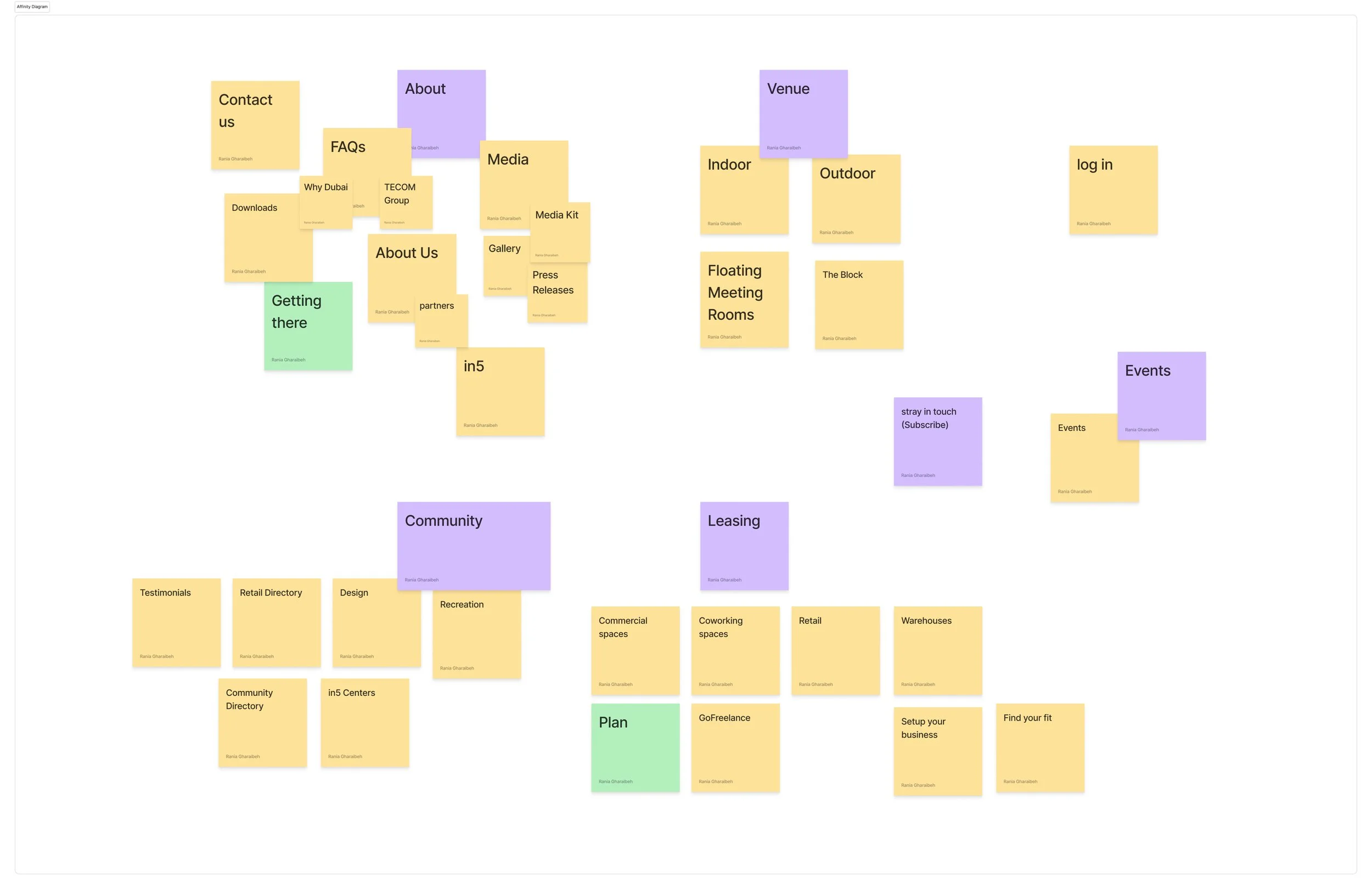
Every page title and content node from the existing site was captured on a sticky note and then reorganised by thematic relevance — revealing a new logical structure.
From Scattered to Structured
The affinity mapping exercise externalised the full complexity of d3's content — 30+ distinct content titles spread across an inconsistent sitemap. Writing each item on a virtual sticky note and physically grouping them by natural affinity revealed clusters that didn't align with the existing menu structure.
New content additions (marked in green) were also proposed during this phase to fill identified gaps:
A "Getting There" page was surfaced as a missing but high-priority utility item for venue visitors.
"Plan" was identified as a new leasing-pathway page to guide prospective tenants.
The existing fragmented community content was consolidated under a single Community cluster.
Media assets (Media Kit, Gallery, Press Releases) were grouped into a clean sub-section under both About and Community.
04 — Information Architecture
A New Site
Structure
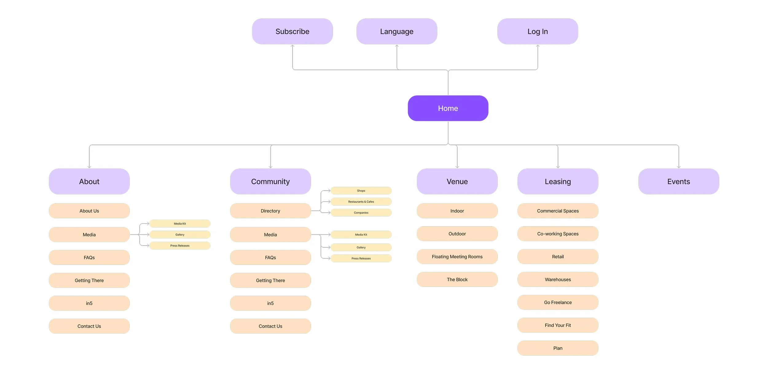
The affinity clusters translated directly into a new five-section navigation structure — simple, scannable, and purpose-driven.
Five Clear Pathways
The new site structure organises everything under five top-level navigation categories, each with a logical second tier. This replaced the previous opaque single-level menu that mixed unrelated topics:
About— About Us, Media (Kit / Gallery / Press), FAQs, Getting There, in5, Contact Us
Community— Directory (Shops / Restaurants / Companies), Media, FAQs, Getting There, in5, Contact Us
Venue— Indoor, Outdoor, Floating Meeting Rooms, The Block
Leasing— Commercial Spaces, Co-working, Retail, Warehouses, GoFreelance, Find Your Fit, Plan
Events— Direct listing of upcoming and past events
Utility items — Subscribe, Language switcher, and Log In — were elevated to a utility bar above the main navigation, keeping the primary menu uncluttered.
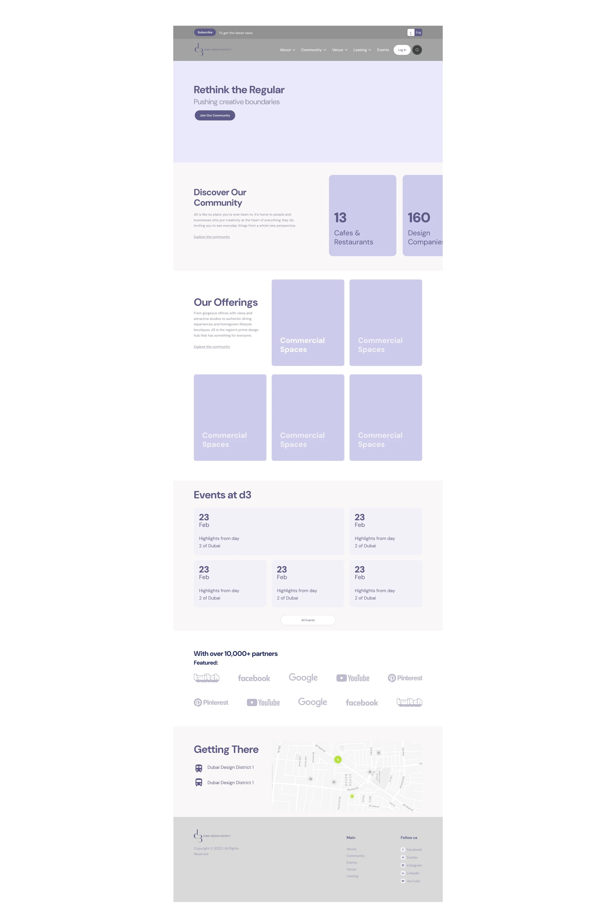
A low-fidelity wireframe established the homepage content sections and their sequencing before any visual design work began.
05 — Wireframe
Structuring
the Homepage
Content Before Color
The wireframe resolved a key tension: balancing d3's visually rich brand with a homepage that is genuinely useful. The solution was a structured sequence of content modules that progressively reveals value — from brand identity to community stats to commercial offerings to live events.
The homepage was structured into six functional sections:
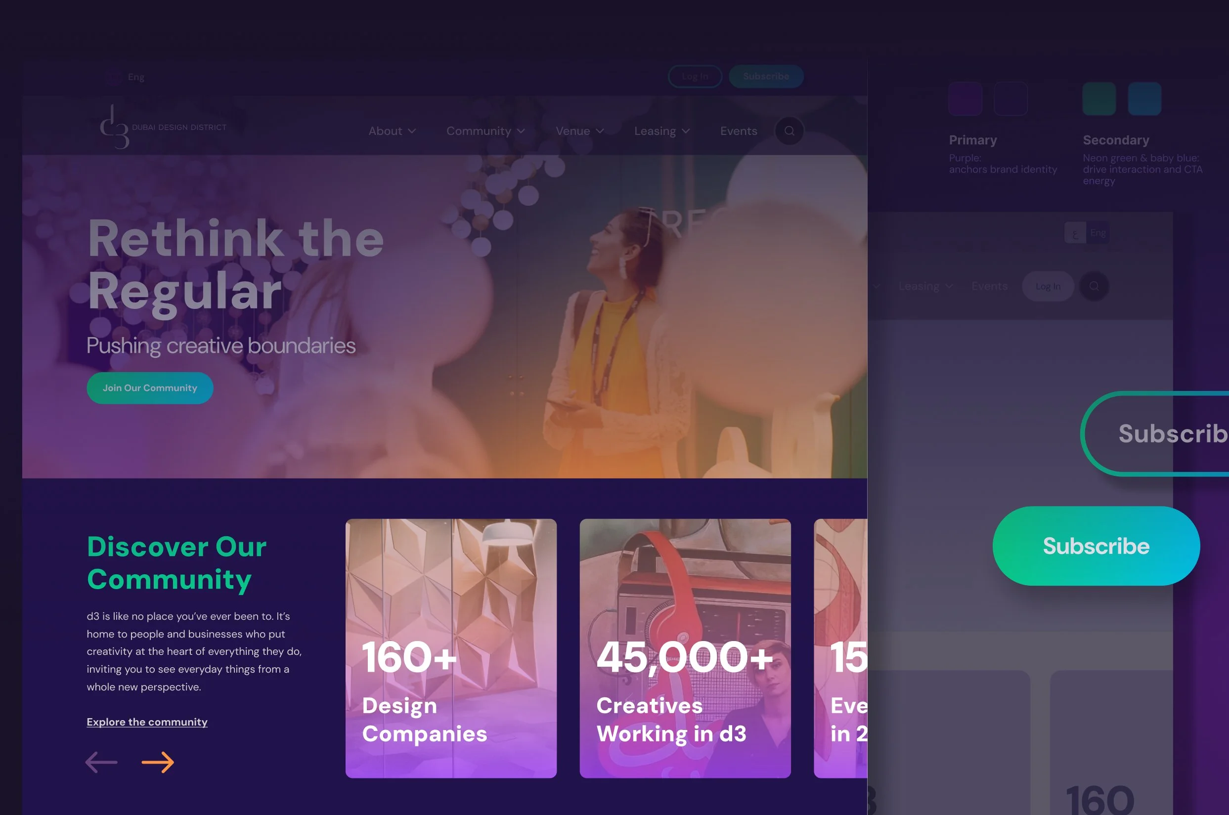
Hero: Full-width brand statement with a single primary CTA ("Join Our Community").
Community snapshot: Scrollable statistics block (160+ design companies, 45,000+ creatives, events count) — replaced the vague copy-heavy section from the original.
Our Offerings: Card-based grid of all six leasing/space types, replacing the buried "What are you looking for?" section.
Events at d3:Dynamic calendar grid of upcoming events with date/title — entirely absent from the original homepage.
Featured Partners: Two-row scrolling logo strip. Condensed from the original to avoid visual noise.
Getting There: Embedded map module with transport options — a new addition surfaced through the affinity mapping.
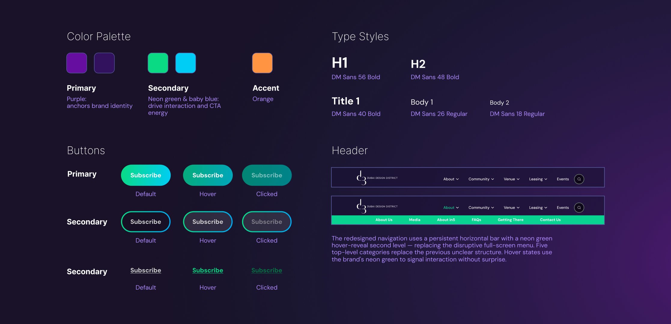
A mini design system established the foundational components before any screen was built — ensuring consistency across every element of the interface.
06 — Design System
A Coherent
Visual Language
Two sources of inspiration grounded the visual direction: the d3 logo emblem itself — with its smooth, rounded geometry and confident simplicity — and the concept of creativity, which purple has long been associated with. These became the two anchors from which color, typography, spacing, and component style all flowed.
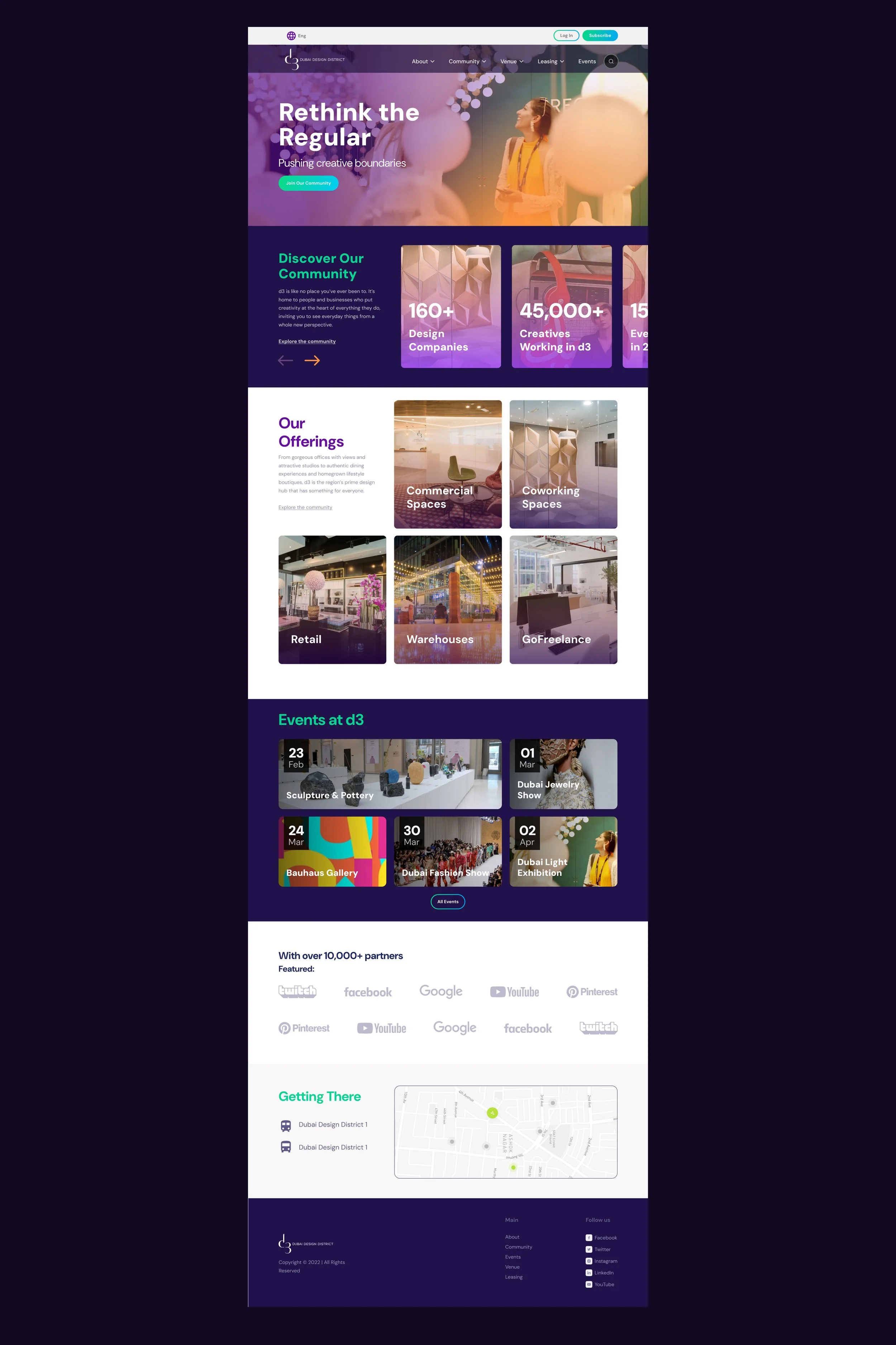
All research, architecture, and system components converged into a high-fidelity Figma prototype — complete with hover states, content cards, and interactive sliders.
07 — Final UI Design
The Redesigned
Home Page
08 — Design Outcomes
What Changed,
and Why It Matters
The redesign addressed every problem identified in the audit — translating research findings into concrete, measurable improvements to the user experience.