Project Type
Mobile Game UX / UI
Year
2019
Client
Jawaker
Monopoly Deal
Mobile Game
Translating the beloved physical card game Monopoly Deal into a fully digital mobile experience, while preserving the competitive tension, card-to-card interactions, and social dynamics of the original, while solving the unique communication and spatial challenges of a screen-based format.
In 2019, only one other app attempted to digitise Monopoly Deal, and it fell short on clarity, interaction design, and player communication. This project set out to do it properly — starting from the physical game itself rather than iterating on a flawed digital precedent.
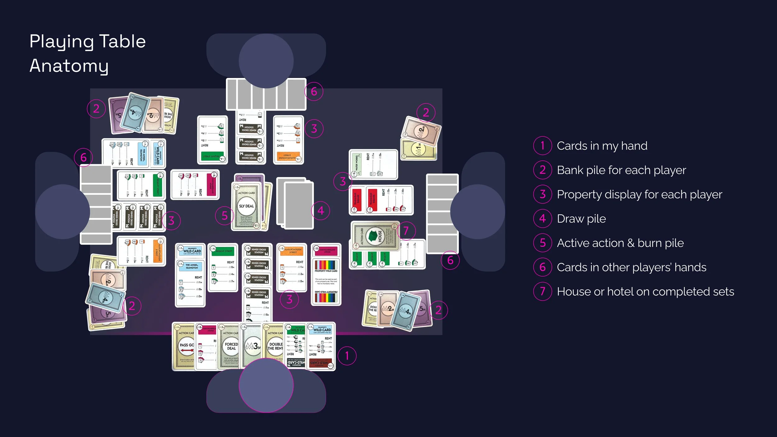
The design process began with extensive play-testing sessions across multiple groups to develop a thorough understanding of game mechanics, edge cases, player communication patterns, and the spatial logic of the physical playing table. This research-first approach ensured no mechanic was overlooked before a single pixel was placed.
From tabletop to touchscreen
Information density
The physical table holds a large number of elements simultaneously. The mobile viewport required a clear hierarchy of what to show immediately and what to layer behind a second tap.
Replacing verbal cues
In-person players constantly communicate — tracking move counts, nudging slow players, announcing actions verbally. All of these implicit signals needed explicit digital equivalents.
Action card complexity
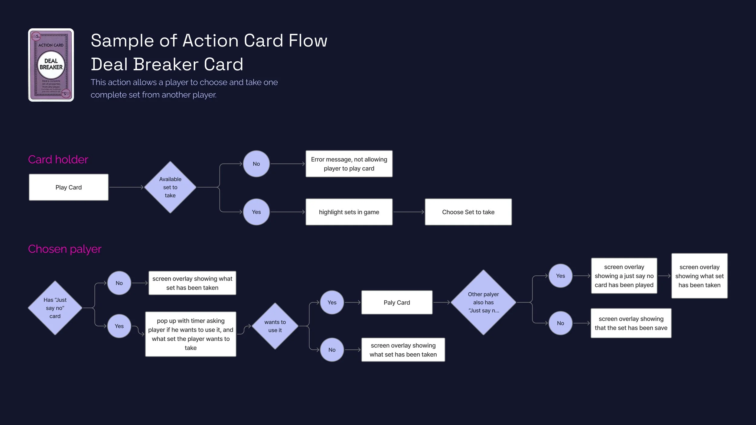
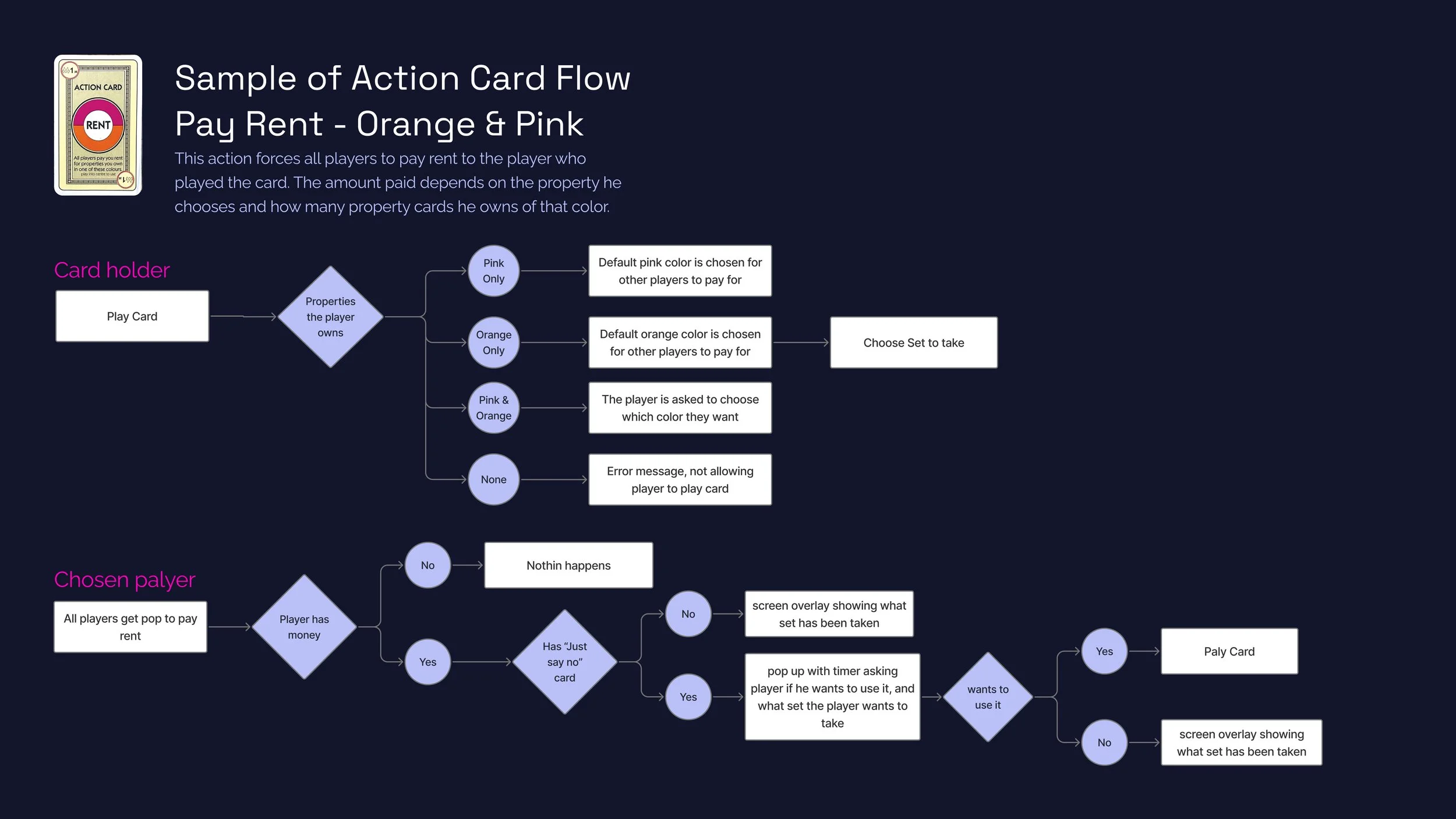
Each action card triggers branching decision trees that can involve all players simultaneously. Flows for each card type had to be fully mapped before UI was designed.
Wild card states
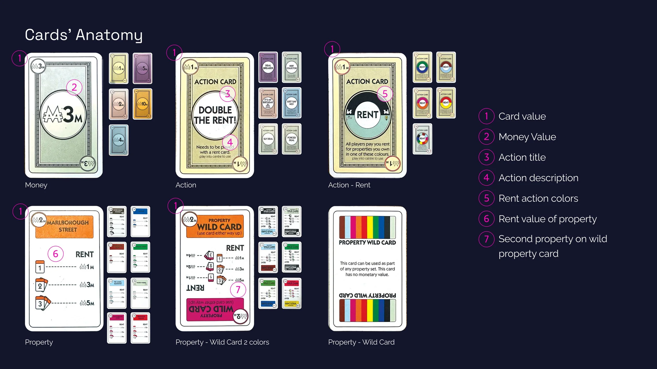
Property wild cards needed a clear visual system to show which color group they belonged to, whether they'd been assigned, and how they contributed to completing a set.
In 2019, only one other app attempted to digitise Monopoly Deal, and it fell short on clarity, interaction design, and player communication. This project set out to do it properly — starting from the physical game itself rather than iterating on a flawed digital precedent.
The design process began with extensive play-testing sessions across multiple groups to develop a thorough understanding of game mechanics, edge cases, player communication patterns, and the spatial logic of the physical playing table. This research-first approach ensured no mechanic was overlooked before a single pixel was placed.
From tabletop to touchscreen
Information density
The physical table holds a large number of elements simultaneously. The mobile viewport required a clear hierarchy of what to show immediately and what to layer behind a second tap.
Replacing verbal cues
In-person players constantly communicate — tracking move counts, nudging slow players, announcing actions verbally. All of these implicit signals needed explicit digital equivalents.
Action card complexity
Each action card triggers branching decision trees that can involve all players simultaneously. Flows for each card type had to be fully mapped before UI was designed.
Wild card states
Property wild cards needed a clear visual system to show which color group they belonged to, whether they'd been assigned, and how they contributed to completing a set.
General Player Turn Flow
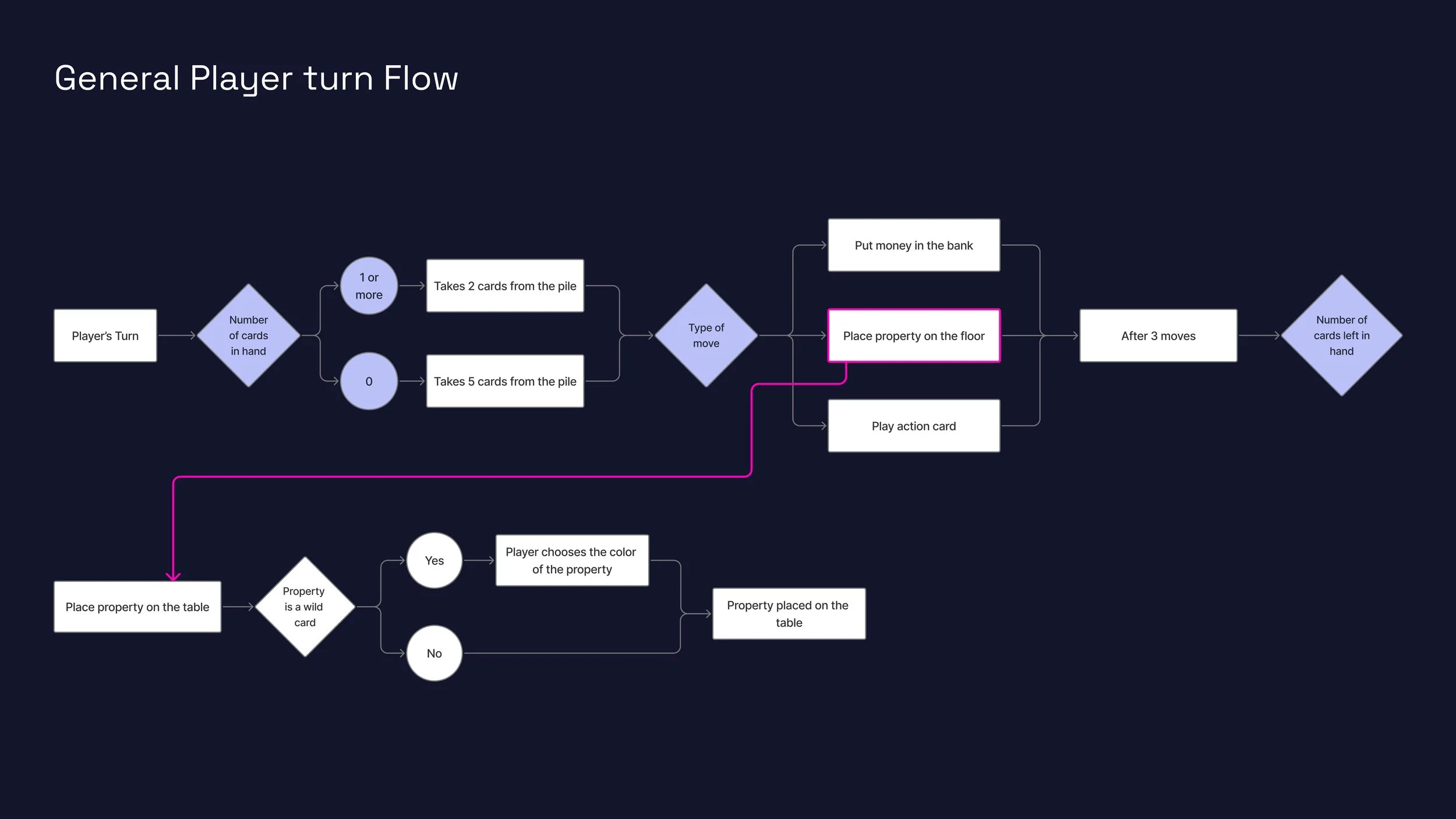
Before any visual design could begin, the complete logic of a player's turn had to be mapped without ambiguity. This flowchart defines every branching decision from the moment a turn starts to the moment it ends; serving as the foundational specification for all subsequent design decisions.
Design steps
Multiple rounds of the physical game were played to observe every possible sequence of actions within a single turn
Edge conditions were identified.
The "place property" branch was extended into a sub-flow specifically to handle wild card color assignment; a mechanic invisible in the linear flow but critical to gameplay
Pink highlighting on "Place property on the floor" was used to visually connect the main flow to its sub-flow below, an early example of the yellow/accent system used throughout
Design justification
Three distinct move types (bank, property, action) are represented as parallel branches from a single decision node, reflecting that players can choose freely
Draw quantity is gated by cards in hand (0 cards = draw 5, otherwise draw 2); a rule often misremembered by players, making this explicit in the system prevents a whole class of UI errors
The sub-flow for wild card color selection is physically separated on the canvas to signal that it is a conditional branch, not a step in the main sequence
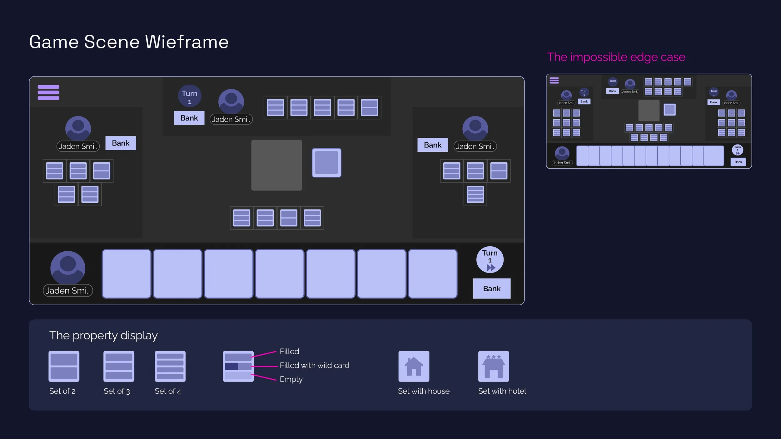
With the table anatomy fully understood, the challenge was to map all of its zones onto a mobile screen. The wireframe stage resolved the spatial logic and information hierarchy before any visual styling was applied. A notable secondary exploration was the "impossible edge case" — a maximum-state scenario that verifies the layout holds even under extreme conditions.
Design steps
Divided the screen into two primary zones: the game table (upper ~70%) and the player's hand (lower strip)
Arranged other players' zones around the table perimeter, mirroring the physical seating arrangement
Designed the property display component in multiple configurations: sets of 2, 3, and 4 cards, with states for filled, filled-with-wild-card, and empty slots
Added house and hotel states to the property display component
Stress-tested the layout by populating it with the maximum number of elements: 12 cards in hand, 9 property color groups, 4 players — the "impossible edge case"
Design justification
The current player's hand is anchored to the bottom — a near-universal mobile convention for "things I control" that reduces thumb travel
Other players' card counts are shown as stacked block icons rather than readable text, intentionally obscuring exact numbers in line with the physical game's information opacity
The property display uses a grid of slots rather than fanned cards so the number of properties and their completion status reads instantly without expanding anything
The wild card slot has a distinct visual treatment (half-filled with a different shade) to signal its dual-color nature even at small sizes
Running the impossible edge case during wireframing, not after visual design, meant layout problems were caught before any visual investment was made
Game Scene Wireframe
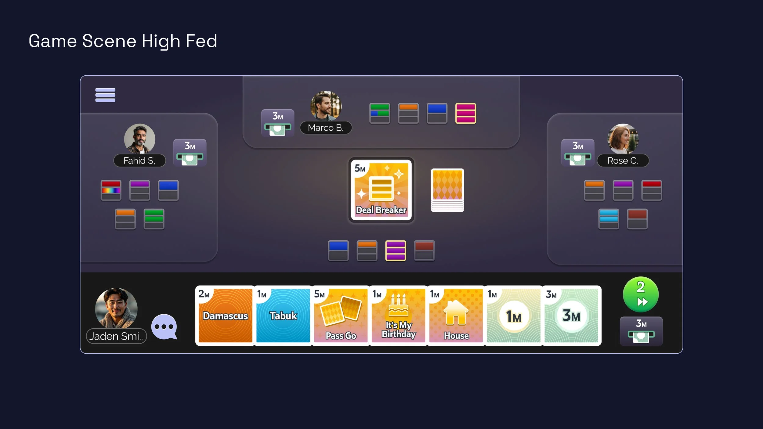
The high-fidelity game scene applies visual design language to the wireframe structure. The result is a dark, immersive game surface with vivid card colors that pop against the background, clear player identity through avatar photos, and a strong visual separation between the active player's hand and the shared game table.
Design steps
Selected a deep navy background to create contrast with the colorful card designs and reduce eye strain during extended play
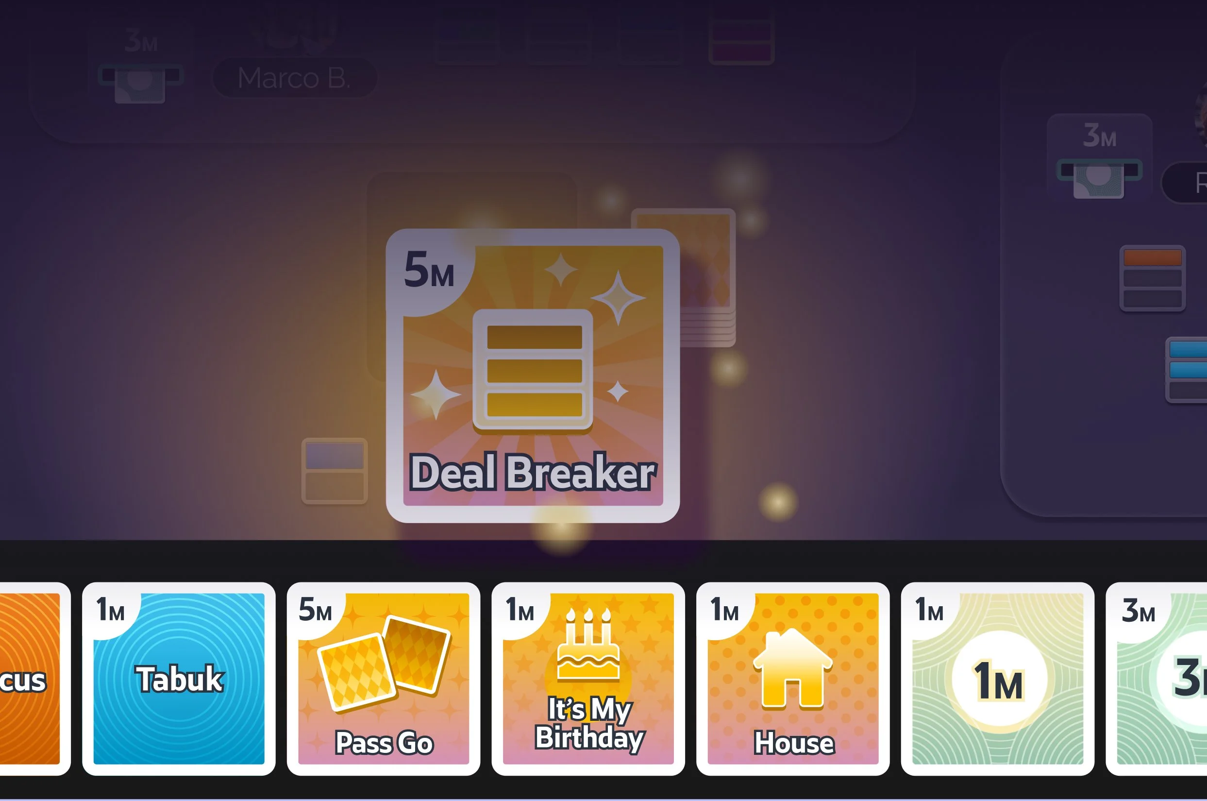
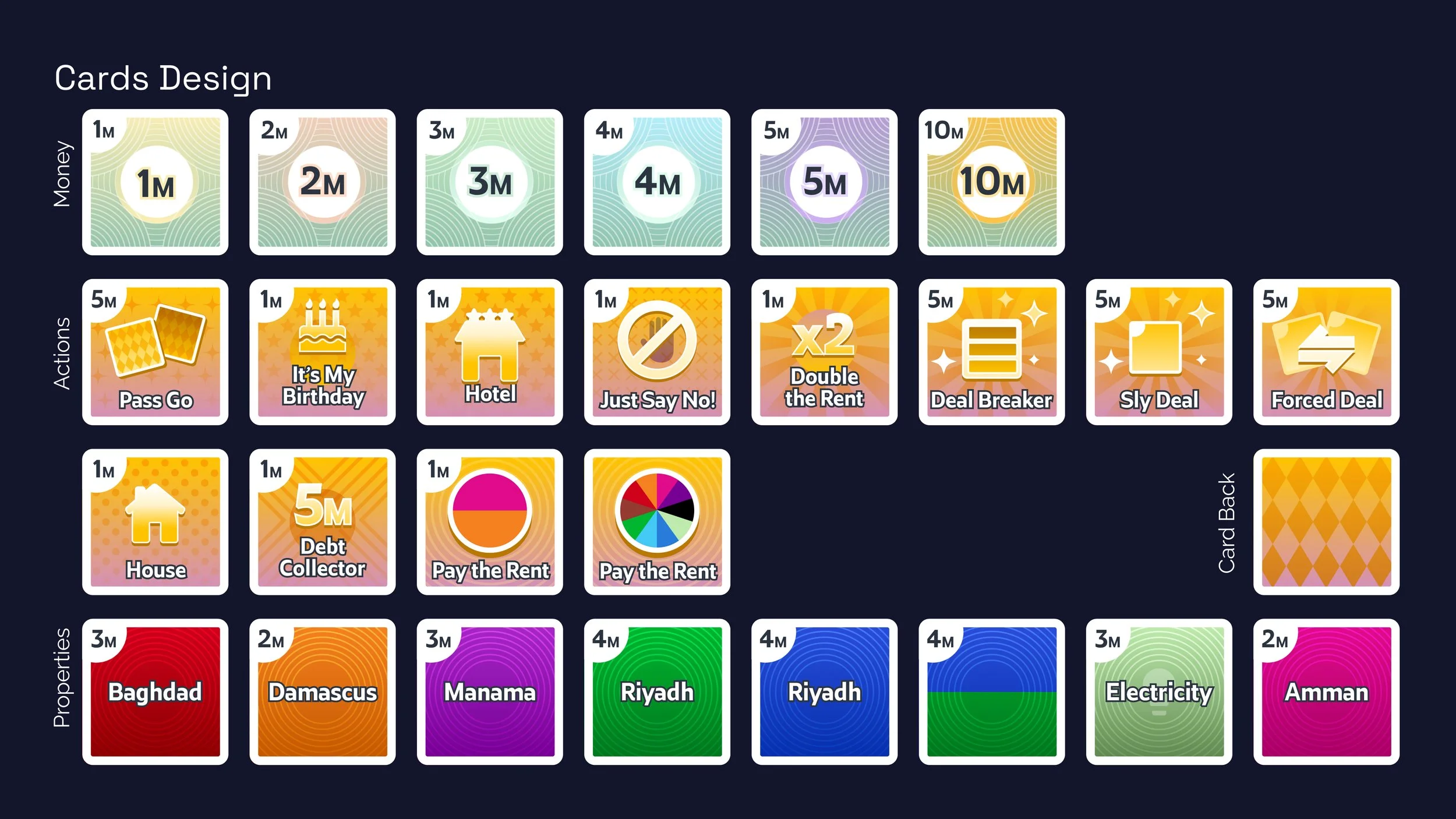
Applied the yellow/amber highlight system to the active card (Deal Breaker card shown enlarged in the center) to communicate that something is being played
Designed property miniature cards using their color-coded property family colors, immediately connecting digital properties to their physical counterparts
Added avatar photos for player identification, replacing the anonymous tokens of the physical game with recognizable faces
Positioned the turn/move counter and bank amount as persistent HUD elements adjacent to the active player's avatar
Design justification
Yellow was chosen as the universal action/highlight color: it is the highest-visibility color on a dark background and is not used by any existing property color group, eliminating ambiguity
Cards in hand are larger than property display tiles; they are the player's immediate decision space and deserve more visual weight
The green circular turn indicator uses a forward-arrow icon to signal "your turn to act" without requiring localized text
Other players' zones are rendered in a slightly dimmed palette, reinforcing the visual hierarchy: the active player's area is the most vivid part of the screen
The bank balance is shown as a pill badge beside each avatar, so players can assess opponents' financial positions at a glance, digitizing a cognitive task that in the physical game requires counting opponent bank cards
Game Scene High Fidelity
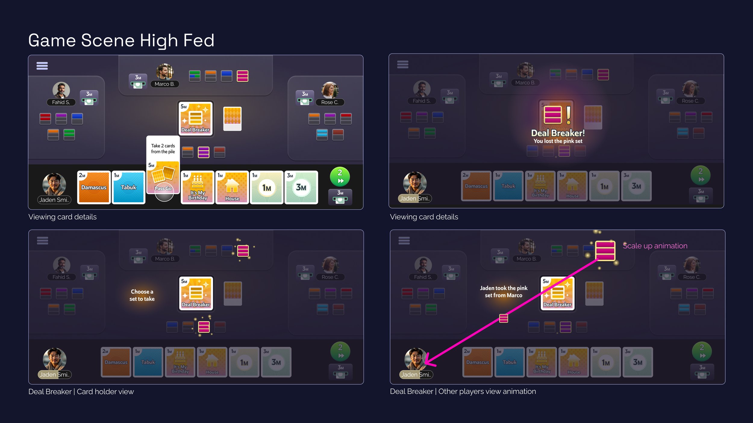
Playing a card is not a single screen state — it is a sequence of states that different players experience simultaneously and differently. This artifact defines the screen states for the card-holder (the player acting) and the other players (who receive the consequence), using the Deal Breaker card as the example.
Design steps
Defined four distinct states for the Deal Breaker sequence: (1) card detail view, (2) notification of loss for the target player, (3) selection state for card holder, (4) animated result for all observers
Designed an overlay notification system for the target player — a full-screen darkened overlay with the stolen set name and a bold "Deal Breaker!" alert
Designed the "Choose a set to take" state: all valid sets on the table are highlighted while others dim, guiding the card holder's selection without requiring an instruction text wall
Designed the property movement animation: a pink arrow traces the path from the stolen set to the card holder's area, accompanied by a scale-up animation on the arriving set
Design justification
The full-screen overlay for the target player ensures they cannot miss the action even if they were not watching attentively, a digital replacement for the verbal "Deal Breaker!" announcement in the physical game
Dimming non-selectable sets during the selection state reduces decision complexity and eliminates the possibility of accidentally selecting a set the rules don't permit
The animated arrow for other players' observation view communicates cause and effect without requiring them to read a log, the movement itself is the story
The scale-up animation on the received set serves as a celebratory micro-interaction for the card holder while also confirming the action completed successfully
Pink/magenta was used for interactive highlights and the movement arrow, distinguishing interactive feedback from yellow (active card) and white (neutral UI)
Game Scene Interaction Variants
Monopoly Deal Mobile required thinking simultaneously as a game designer, information architect, UX designer, and systems engineer. Every artifact in this case study exists because it resolved a real ambiguity before that ambiguity could become a design mistake — from the general game flow that caught the wild card assignment gap, to the impossible edge case wireframe that validated the layout under maximum load.
The most distinctive challenge was designing for players who are not in the same room. Every verbal cue, social glance, and shared understanding of the physical game had to find a digital equivalent. The result is a system that replaces those implicit signals with explicit, timed, animated, and visually prioritized information — without making the game feel mechanical.